Image Credits: Author
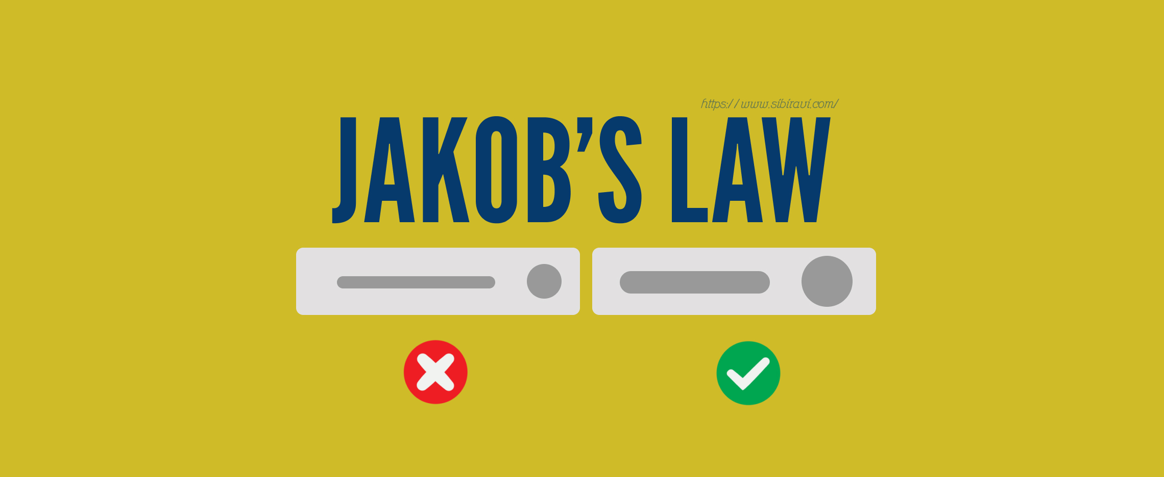
Jakob’s Law in UX Design: Designing with Familiarity in Mind
Sibi Ravi
Published on September 04, 2024
When a UX design is implemented, there must be a user experience created. How does one achieve such a seamless experience? One of the principles that aid in this concern is Jakob’s Law. Whether you are a master of the craft or a novice, insights into Jakob’s Law will help you enhance the efficacy of your designs. Let’s see what Jakob’s Law is, how to use it in practice and what benefits it brings to users. 🌐 🎨
What is Jakob’s Law?
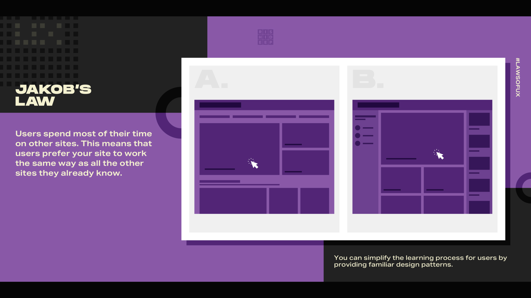
Image Credits: Rishi, Dribble
One of the most influential web usability professionals, Jakob Nielsen, created the law of Jakob: “Users are disoriented because most of the time, they are at other websites.” Thus they want your site to share some features and work similarly to all other sites they have already visited. In other words, general users tend to anticipate form of uniformity amongst various websites and their respective applications because they have been acclimatized to certain norms and standards. 🧭 💻
(Example:) when you open a new site, you may hold certain expectations about where things go. For instance, the search box should probably be on top, the navigation bar should be somewhere at the top or left of the site, or the logo has a feature of being hyperlinked back to the homepage. Such rules help users utilize new systems because they use what they know in new surroundings.
Why Jakob’s Law Matters in UX Design
Jakob’s law is important since it speaks towards the fundamental principle of user experience which is comfort. In such scenarios, because they have seen similar interfaces before, users wouldn’t take time to learn how to use the new information system – they will get to it. This decreases attention and helps users take their actions in a straight path without aiming for extraneous targets. With the dearth of the attention span of the users and also the cutthroat competition, implementing JAKOB’S LAW can help your design to a considerable extent. 🌟 🚀
Implementing Jakob’s Law in UX Design
1. Stick to Established Conventions

Image Credits: Musemind
The design resembles the appearance of an Online Preparation project webpage, on which lazy designers tend to copy pasting from other sources. The use of Convention is by far the most simple way of applying Jakob’s Law. Conventions include commonplace patterns and layouts which have become the norm. For example, the navigation menu is more likely to be placed at the top or to the left of a page when a shopping cart icon is used for e-commerce purposes or whenever a mouse pointer hovers over an image, that image changes in colour. Conventional approaches place users in an environment that they are used to hence making it easy for them to operate on your site. 🛠️ 📂
(Example:) Usually, users think of the shopping basket icon wherever they see it in the upper right corner when coming up with an E-commerce website, it is essential to ensure that the Shopping cart icon is in the upper right. This is directed bottom to that of the experiences of their usage of other online stores for example Amazon’s or E bay or the places where one must find things like a cart. If they have this cum expectation met, chances of them getting annoyed, are minimal and chances of doing very smooth shopping is positive.
2. Don’t Reinvent the Wheel

Image Credits: Twitter
While innovation is cool and all, sometimes trying to reinvent the wheel can just mess things up. If you throw a whole new way of getting around your website at people, they might get lost and annoyed. It's way better to just make tweaks to the stuff that's already there and keep it simple. That way, people can enjoy using your site without getting a headache from trying to figure out where everything went. 🛑 💨
(Example:) Think about it like making a new social media thing. Instead of going all out with a crazy new way to explore, stick with the basics like a news feed, little notifications popping up, and a profile page everyone knows. This way, users can jump right in and get to the good stuff without stressing over a new interface. They'll be scrolling through your platform like it's second nature in no time! 💃 💻
3. Consistency Across Platforms
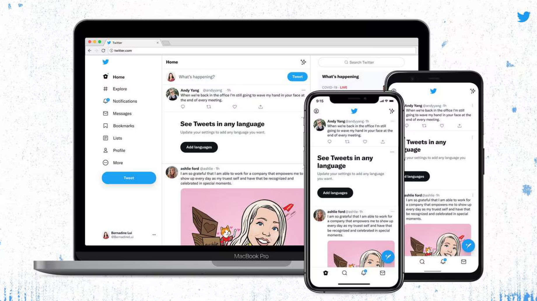
Image Credits: Twitter
Jakob's Law is relevant when we talk about keeping things consistent across different gadgets, like a computer and a smartphone. If your website has a full-size version and a smaller one for mobile, it's super important to keep the look and feel the same. That means using the same symbols, colours, and how you move around the site on both. When everything's consistent, it's like giving users a cheat sheet for your website, making it a breeze to switch from one device to another. It's all about that familiar vibe, which helps people get stuff done quicker and easier. 📱 💻
(Example:) Imagine you've got a banking app that you use on both your computer and your phone. If the way things are set up and work is the same on both, you won't have to start from scratch every time you switch devices for simple things like moving money around or checking your balance. This sameness makes the whole experience smoother and builds up that trust factor with the users.
4. Test with Real Users

Image Credits: Think with Google
It's really important to test your designs with actual people, even if you're sticking to the usual rules. Getting real users to play around with your stuff lets you see where they might stumble. If they have a hard time doing something simple or look confused, it could mean you should use layouts they're more used to. 👩💻
(Example:) Imagine you're working on a cool new part for a tool that helps people manage projects. When you test it, you see that folks can't find the "Add Task" button because it's not where they expect it to be. If you move it to a spot that's more standard, like right beside the project name or in a handy toolbar, you can make it easier for them to use and they'll thank you for it.
Key Takeaways
1. Familiarity Breeds Usability:
Users expect new interfaces to function like the ones they’re already familiar with. Meeting these expectations leads to a smoother and more satisfying experience.
2. Adopt Established Patterns:
Use well-known design conventions to guide your decisions. This includes everything from navigation structures to iconography.
3. Consistency is Key:
Ensure your design is consistent across different platforms and devices, reinforcing familiar patterns.
4. Test and Iterate:
Regularly test your designs with real users to ensure that familiarity is maintained, and make adjustments based on their feedback.
Final Thoughts
Jakob’s Law is like that friend who reminds us that keeping things familiar in UX design can be a real game-changer. When you design with patterns that users are already comfy with, it’s like giving them a cosy blanket of intuitive navigation. Sure, shaking things up with innovation is cool, but remember, the main deal is to make their experience as smooth and fun as sliding into a pair of well-worn slippers. The idea is to have users loving their journey on your website or app without breaking a sweat. And that, my friends, is where Jakob’s Law shines. It’s like the secret sauce to a great UX experience. 👨💻 💃