
Image Credits: Author
Hick’s Law in UX Design: Simplifying Choices for a Better User Experience
Sibi Ravi
Published on September 03, 2024
In the world of UX design, simplicity often reigns supreme. One of the guiding principles that help us achieve this simplicity is Hick’s Law. Whether you’ve heard of it or not, Hick’s Law is at play in many of the interfaces and experiences you interact with daily. But what exactly is Hick’s Law, and how can it be effectively implemented in UX design? Let’s dive in! 🧠 🎨
What is Hick’s Law?
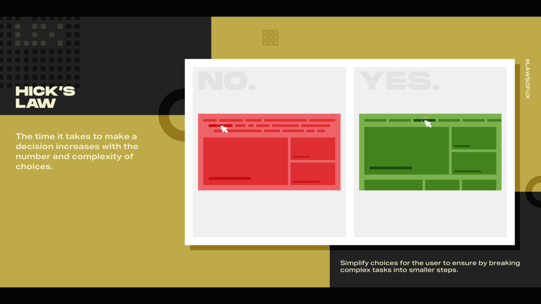
Image Credits: Rishi, Dribble
Hick’s Law, named after British psychologist William Edmund Hick, is a psychological principle that states the time it takes for a person to make a decision increases with the number of choices they are presented with. Simply put: the more options you give someone, the longer it takes them to choose. 🕒 🔢
In UX design, this law is incredibly relevant. Every time a user is presented with multiple navigation links, form fields, or product options, they must make a choice. The more options there are, the more overwhelmed the user may feel, leading to indecision or even abandonment. Hick’s Law reminds us that by simplifying choices, we can speed up decision-making and create a more efficient, user-friendly experience.
Why Hick’s Law Matters in UX Design
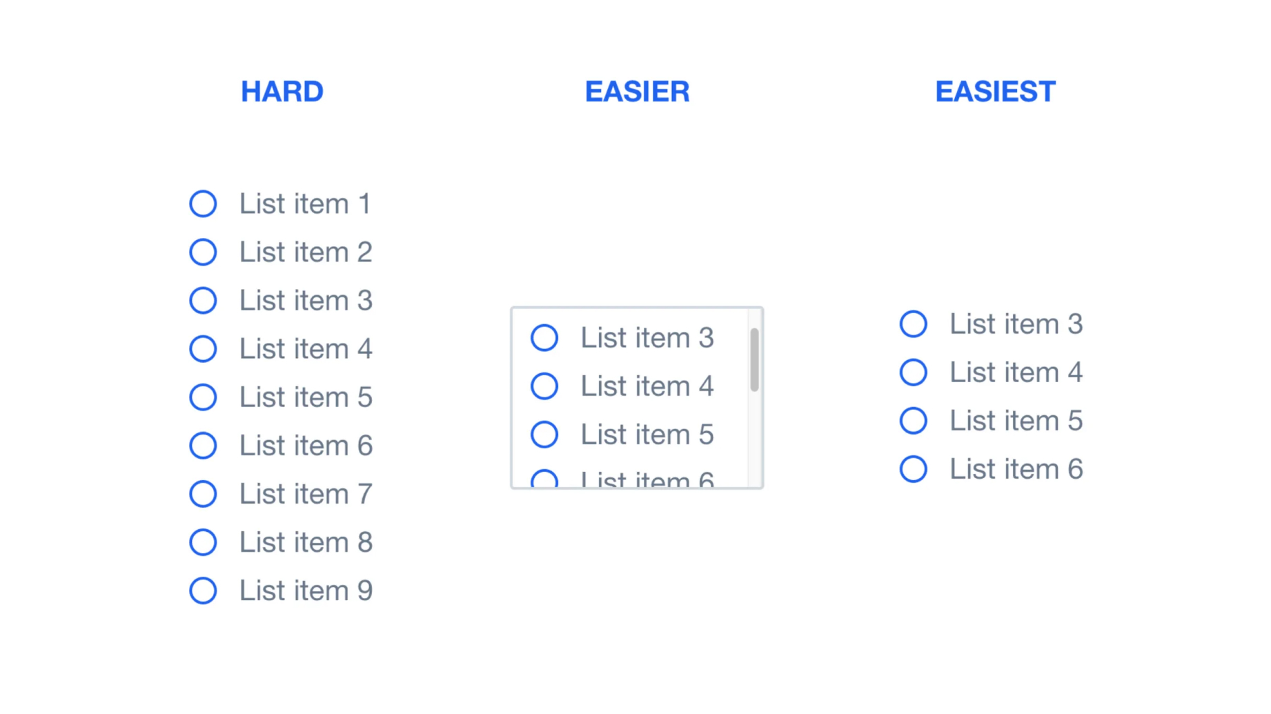
Image Credits: Sonja Hoffmann
The essence of good UX design is creating experiences that are intuitive and easy to navigate. Hick’s Law plays a crucial role in this by emphasizing the importance of minimizing cognitive load. When users are faced with too many choices, their cognitive load increases, leading to frustration and decreased satisfaction. By understanding and applying Hick’s Law, designers can reduce cognitive load, making it easier for users to find what they need and take the desired action. 🌐 💡
Implementing Hick’s Law in UX Design
1. Simplify Navigation

Image Credits: Yarsa
One of the most common places Hick’s Law is applied is in website navigation. When users land on a website, they should be able to find what they’re looking for quickly. A navigation menu with too many options can overwhelm users and slow them down. To avoid this, prioritize the most important sections and group related items together. For example, instead of having 10 separate links in your main navigation, you could create a few key categories with dropdown menus that neatly organize sub-items. 🗂️ 🔗
2. Limit Choices in Forms

Image Credits: Nick, Webflow
Forms are another area where Hick’s Law can make a big impact. Long, complicated forms with too many fields can deter users from completing them. Instead, only ask for the most essential information. If possible, break down the form into smaller sections or use progressive disclosure, where additional fields only appear as needed. This approach simplifies the decision-making process, making it easier for users to complete the form. ✍️ 📄
3. Optimize Product Pages
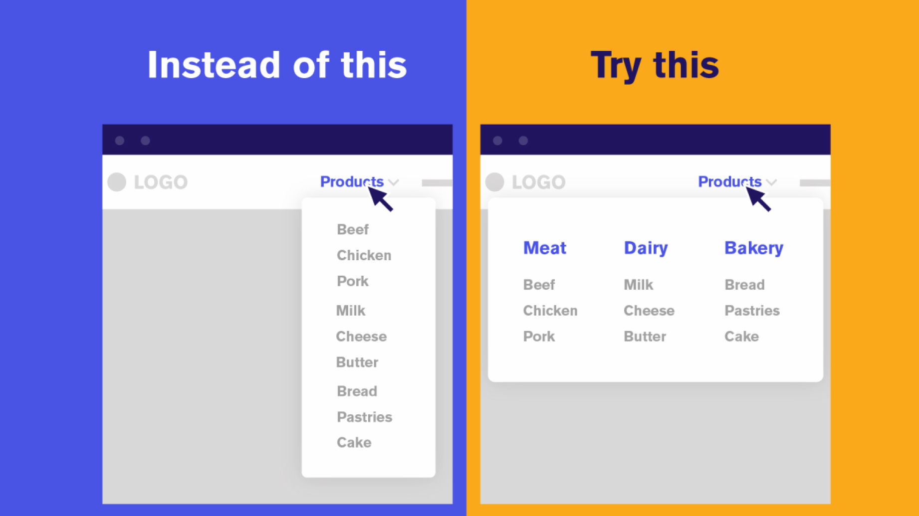
Image Credits: Mighty Fine
E-commerce sites present users with a plethora of product options, which can lead to choice overload. To implement Hick’s Law, consider featuring a “Top Picks” section or a “Best Sellers” list to guide users toward popular choices. Additionally, using filters and sorting options allows users to narrow down their options more easily, helping them make a decision faster. 🛒 🛍️
4. Use Visual Hierarchy
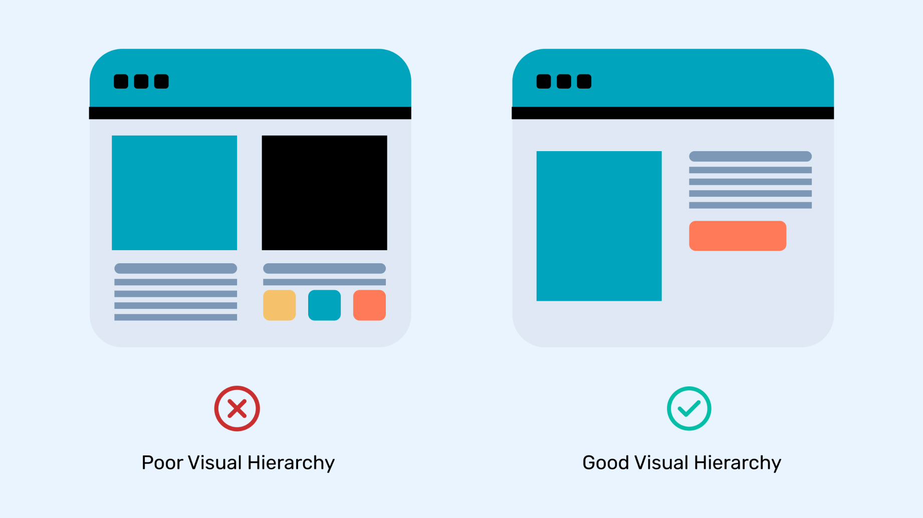
Image Credits: Think360
Visual hierarchy is a powerful tool in UX design that can help manage the number of choices a user has to make. By emphasizing the most important elements on a page, you can guide users’ attention and reduce the perceived complexity of their choices. For example, a CTA (Call to Action) button that stands out through size, color, or placement will naturally draw the user’s eye, making it more likely that they’ll take the desired action without being distracted by other options. 🎨 🔝
5. Provide Clear Guidance

Image Credits: Admiral.digital
Sometimes, users need a little help making decisions. Providing clear instructions or recommendations can simplify the process. For instance, if you’re designing a software onboarding flow, you might highlight the most common setup options with a “Recommended” tag. This reduces the user’s cognitive load by steering them towards a choice that’s likely to be the best fit, reducing decision fatigue. 💬 📋
Real-World Example: Apple’s Product Pages 🍎
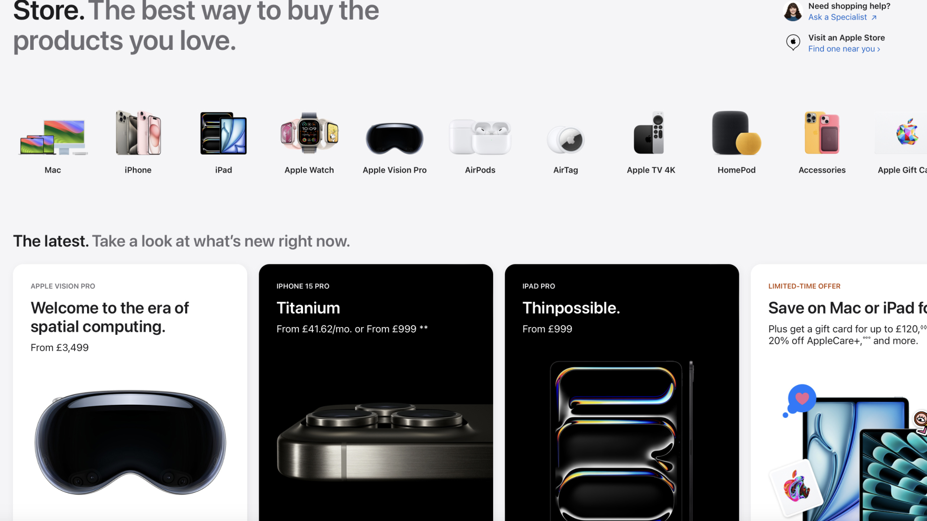
Image Credits: Apple
Apple is a master of applying Hick’s Law in its product pages. When you visit an Apple product page, you’re typically presented with a few key models to choose from, each differentiated by features and price. Instead of overwhelming users with every possible configuration, Apple simplifies the decision-making process by highlighting popular choices and providing easy-to-understand comparisons. This approach makes it easier for users to select the product that best fits their needs without feeling overwhelmed by too many options.📱
Key Takeaways
1. Less is More:
When it comes to choices, more isn’t always better. Simplifying options can lead to quicker decisions and a more satisfying user experience.
2. Prioritize and Group:
Organize information in a way that prioritizes the most important choices and groups related options together to reduce cognitive load.
3. Guide Your Users:
Use visual hierarchy and clear recommendations to guide users towards the best decision, making their experience smoother and more enjoyable.
4. Test and Iterate:
As with all UX principles, testing is key. Use A/B testing to see how different levels of choice impact user behaviour and adjust accordingly.
Final Thoughts
Hick’s Law is a fundamental principle in UX design that reminds us of the importance of simplicity and clarity. By reducing the number of choices and guiding users through a streamlined decision-making process, we can create experiences that are not only more efficient but also more enjoyable. So, the next time you’re designing an interface, remember that less really can be more—and Hick’s Law is your go-to guide for making it happen. 🙌 💡